The Board’s Logo

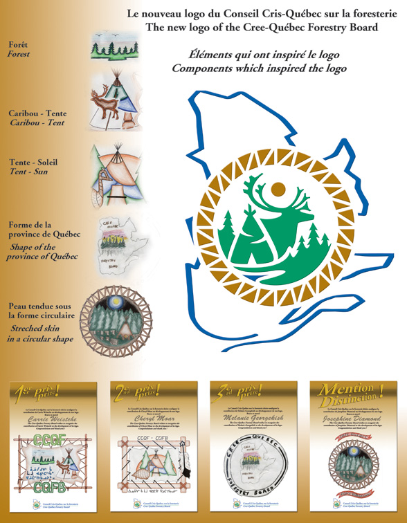
The logo of the Cree-Québec Forestry Board (CQFB) symbolizes the desire to unite traditional and modern-day forestry-related knowledge, in keeping with sustainable development. It was inspired by some 30 drawings done by children from the Cree communities (more specifically the finalists) for a contest launched in fall 2004 on Agreement territory.
Elements of the drawings used to create the logo
Elements typical of the Cree culture are superposed on the province of Québec: a hide stretched over a circular wooden frame; a teepee and a caribou in a natural environment amid evergreens and near a body of water; a sun-moon-star representing the cycle of life and the forest which is renewing itself. The pure, clear-cut forms and symbolic colours recall the tradition of Native art: green for forestry and brown for the earth; the blue symbolizes the province of Québec.
Shown to the right of the logo, the Board’s name in French and English is turned toward the future.

